Design challenge for RD Station Partners Marketing
I streamlined the search and optimized the user's decision to choose a partner agency to work with
When I identified that the partner portal suffered from usability problems - with a confusing interface, unintuitive filters and a fragmented journey that made it difficult to navigate and understand the benefits - I reformulated today's structure and filters so that users can find agencies quickly, choose partners agencies easily and have a more fluid conversion experience.
Read the Full Case Here
Or just read the case overview bellow
When Interviewing a user, I understand that:
The older interface confuse the users by misunderstanding the agency ranking system, assuming it's based on price rather than other criteria. They might struggle with filters, face navigation issues due to screen resolution, and feel overwhelmed by the large number of agencies displayed. Lower-ranked agencies may be avoided if the ranking criteria aren't clear.

New interface was based on research with real user for this challange
A user journey analysis was conducted to better understand behavior patterns when facing barriers. This was used as a basis for general improvements, aligned with the challenge’s main objective.

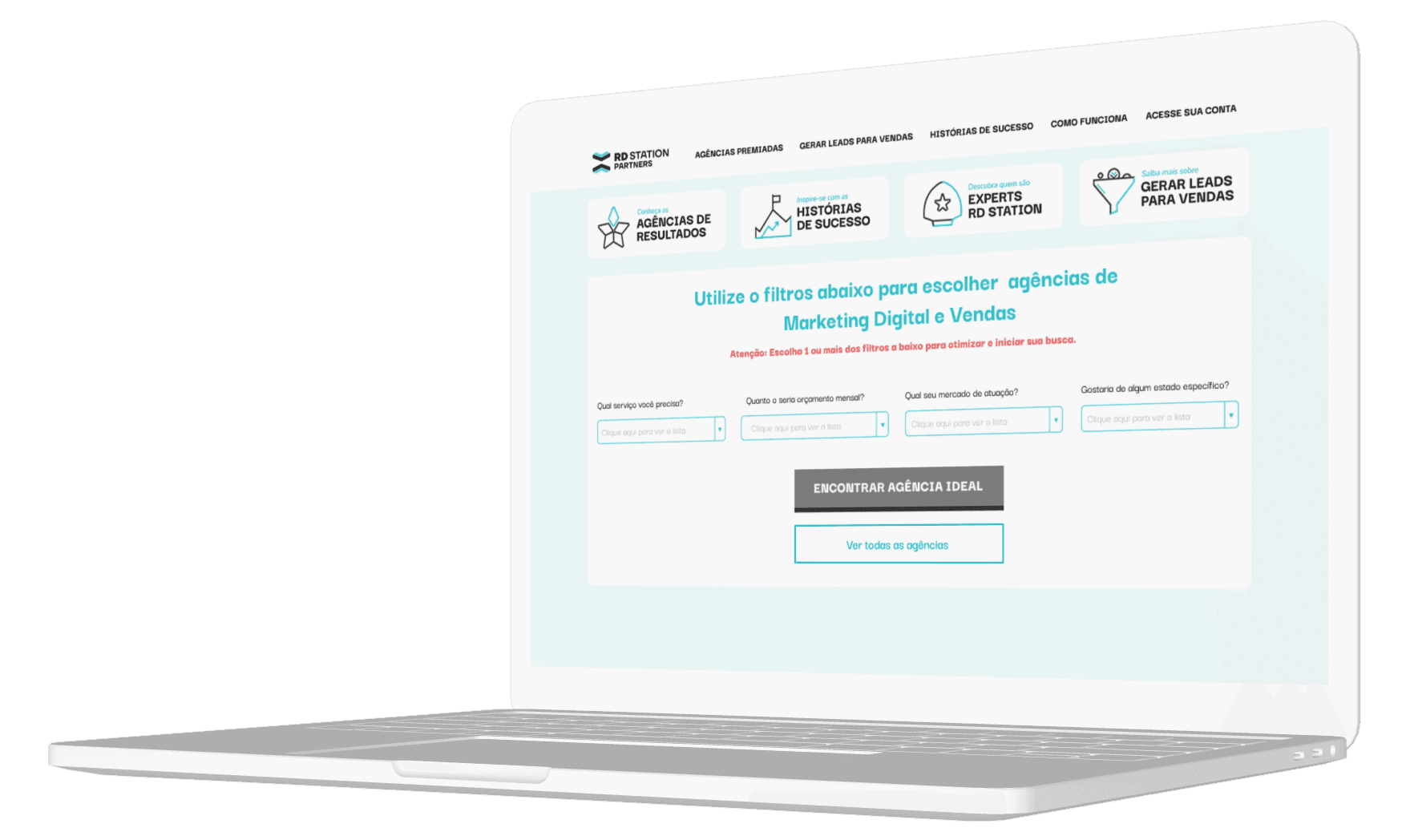
Before
Ranking system is unclear to users.
Filter is not as effective as expected.
Filter simplification micro-interaction failed due to screen resolution issues.
Users focused on price perception, assuming lower-ranked options were cheaper.
Users felt overwhelmed by the large number of agencies.
Users wanted clearer explanations on some agency pages they visited.
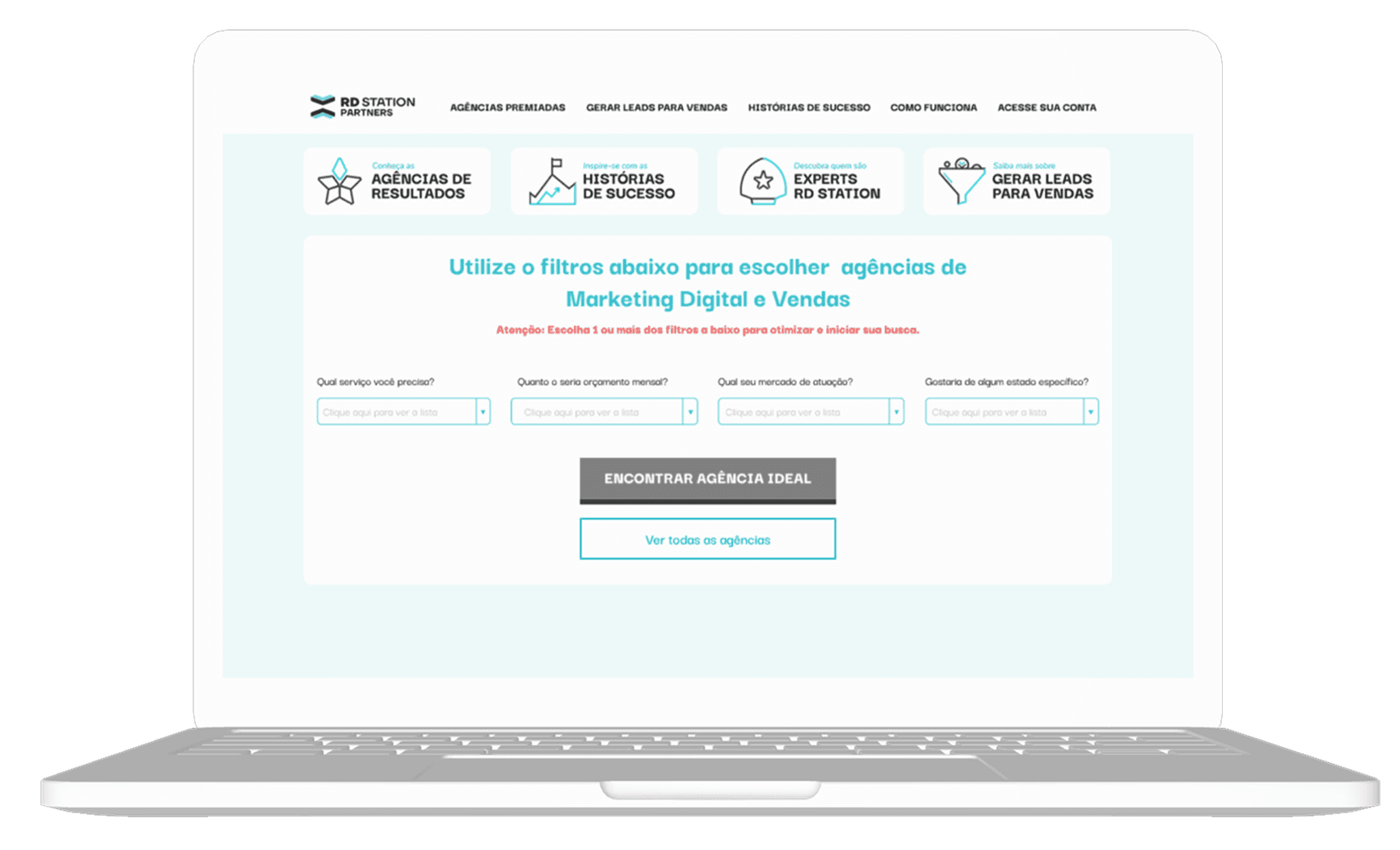
After
Revise homepage: Improve micro-interactions for clarity.
Inspiration: Use Google's clean navigation.
Enhancement: Add auto-scroll after filtering for better user orientation.
Simplify tags: Group into clear sections with micro-explanations.
Goal: Help users understand rankings and their role in decision-making.
Clarify certifications: Explain their significance and value.
Impact: Users recognize certifications as validation of strategic expertise.
Ensure design consistency: Standardize across all screens, pop-ups, and contact forms.
Improve contrast: Enhance visibility in specific areas.
Apply psychology principles: Optimize UI effectiveness.
Refine "Partner" page: Improve clarity and engagement.
Optimize whitespace: Adjust "Services" text block for better readability.
Highlight case studies: Make agency success stories more prominent.
Clarify "Courses & Certifications" section: Ensure better user understanding.
Refine "Address" section: Improve structure and usability.
Metrics that will receive the impact:
Conversion Rate: A smoother, more consistent user journey reduces friction and uncertainty, leading to higher conversion rates.
Bounce Rate: Enhanced consistency and clearer navigation keep users engaged, which typically lowers bounce rates.
Task Completion Rate: By addressing pain points and improving usability, more users complete desired actions (such as form submissions or checkouts).
User Engagement: Metrics such as time on site, page views per session, and click-through rates usually increase as the experience becomes more intuitive.
Error Rate: A consistent design and clearer guidance reduce user errors, improving overall effectiveness.
User Satisfaction: Improvements are often reflected in higher satisfaction scores and metrics like Net Promoter Score (NPS), indicating a better overall experience.


Hello! Let's talk?
Chat with me on Whatsapp