
RD Station
CASE STUDY
Marketplace Redesign Proposal
The Challenge
The hiring manager at RD Station requested a UX-focused redesign of the Partner Marketing Portal to enhance partner retention.
Hypothesis
UX and interface design issues.
No user feedback monitoring or scenario mapping.
Inconsistent experience for users and partner agencies.
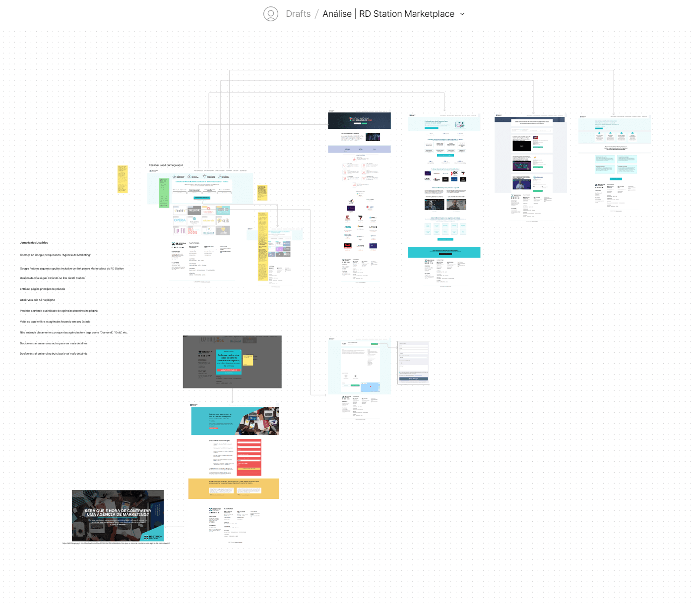
The process
Discovery
Design Review
Assumptions & Hypotheses Based on Analysis
User Interviews & Usability Testing with the current solution
Validation of Assumptions & Hypotheses
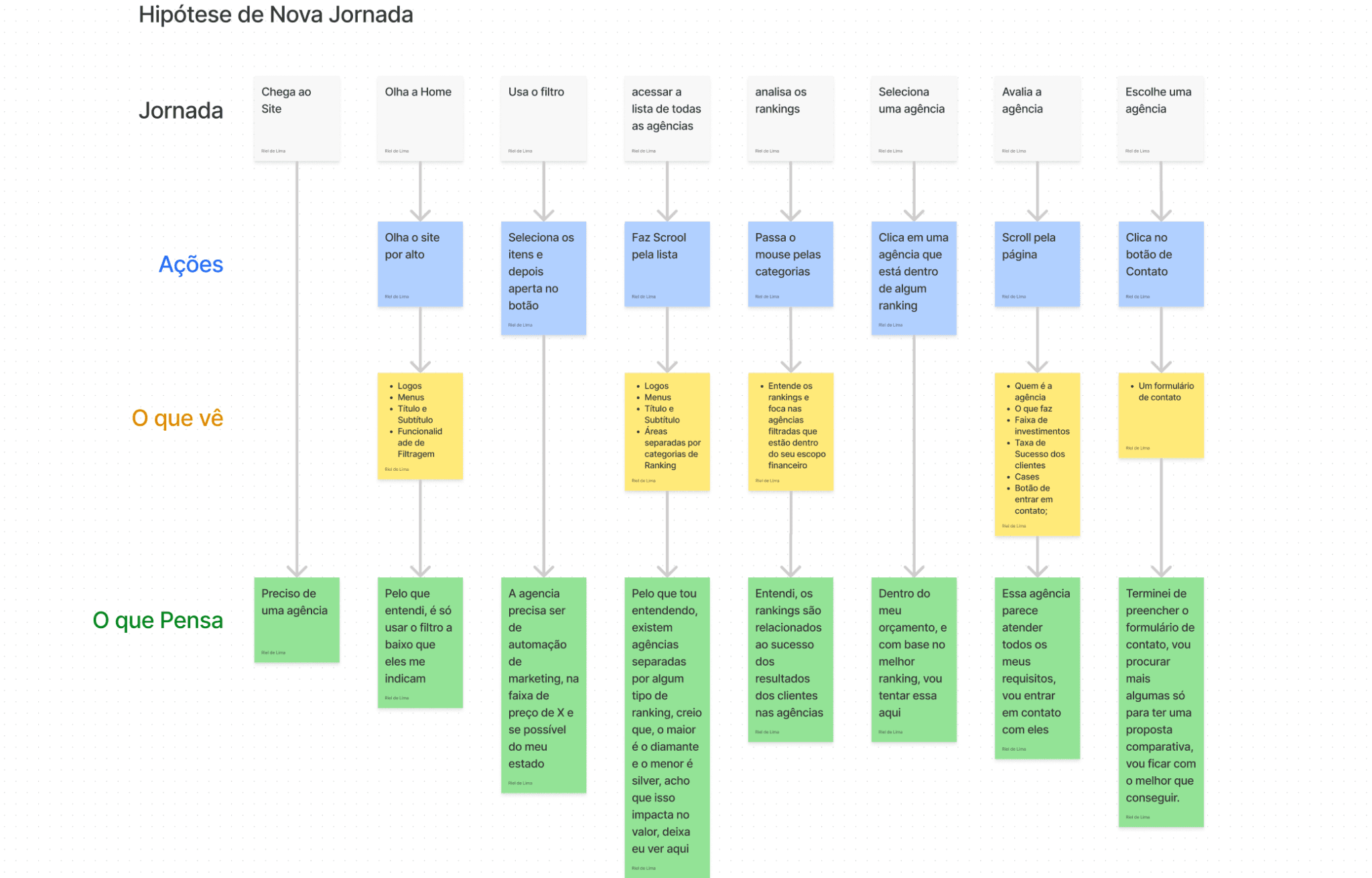
User Journey Mapping
Pain Points Identification
Improvement Suggestions
New User Journey Based on Improvements
Expected Positive Impact
Design
Sketching Flow Improvements
UI Enhancements Analysis
Prototyping the Improvements
Validations
User Interview & New Usability Test + Final Insights
Roadmap, Key Learnings & Conclusion
Why this process?
Based on Design Thinking and User-Centered Design, this approach ensures a precise, clear, and targeted experience for users seeking a agency to help then with the marketing of they business
What I wanted to achive?
Expertise in designing effective page converstion and retention tailored to users' needs.
Building trust, encouraging a better user journey to choose the best marketing partner agency for his/her needs.
What is expected?
Users satisfied with the available information.
Users feel safe due to visual design, usability, and content.
Easy navigation on the partners page.
Solution tested with real user feedback.
Navigable layout and prototype.
Positive user testing results.
Minimal design adjustments needed.
Discovery
Desk Research
Who is the user?
Entrepreneurs looking for an agency that:
Works with marketing automation using RD Station
Offers digital marketing services
Helps clients quickly find a trusted partner agency
Design Audit
The main reason for applying this design analysis is the practical foundation behind these concepts. These tested and widely used frameworks have become industry standards, helping to:
Enhance quality and user experience and reduce risks throughout the project
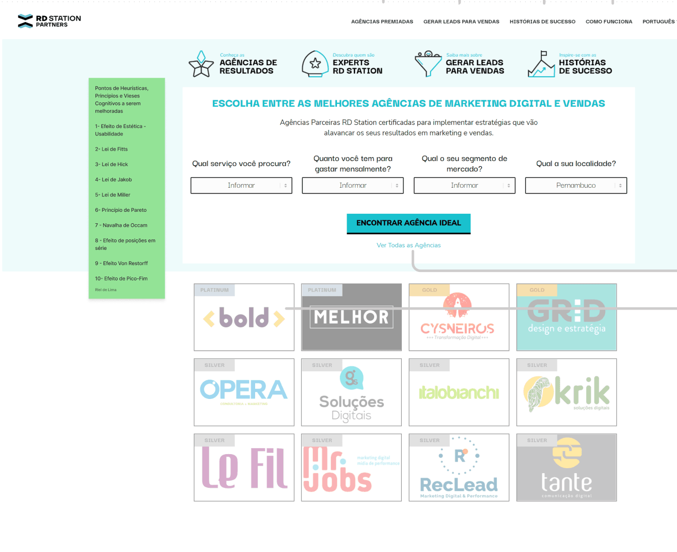
More Hypothesis
These insights were gathered from the Design Analysis and general observation of how information is structured in the current solution:
Users may not understand the agency ranking system.
Ranking could be mistaken as price-based.
Users might feel lost when using the filter initially.
Navigation issues may occur due to screen resolution.
Lower-ranked agencies may be ignored if the ranking isn't clear.
Users may feel overwhelmed by too many agencies on the homepage.
Quick Interview

These insights were gathered from the Design Analysis and general observation of how information is structured in the current solution:
Unclear ranking purpose: Users may not understand the ranking system.
Misinterpretation: Users might assume rankings are price-based.
Filter confusion: Users could feel lost when applying filters initially.
Navigation issues: Screen resolution may affect usability.
Avoidance of lower-ranked agencies: Lack of clarity may lead users to ignore them.
Overwhelm: Too many agencies displayed on the homepage may feel excessive.
Validations and Inisghts
Based on this discussion, I was able to validate some previously identified issues:
Unclear ranking system for users.
Filter not as effective as expected.
Filter simplification issue due to screen resolution.
Users focused on perceived cheaper options based on ranking.
Overwhelmed by too many agency choices.
Need for clearer explanations on agency pages.
Mapping the Journey
A user journey analysis was conducted to better understand behavior patterns when facing barriers. This was used as a basis for general improvements, aligned with the challenge’s main objective.
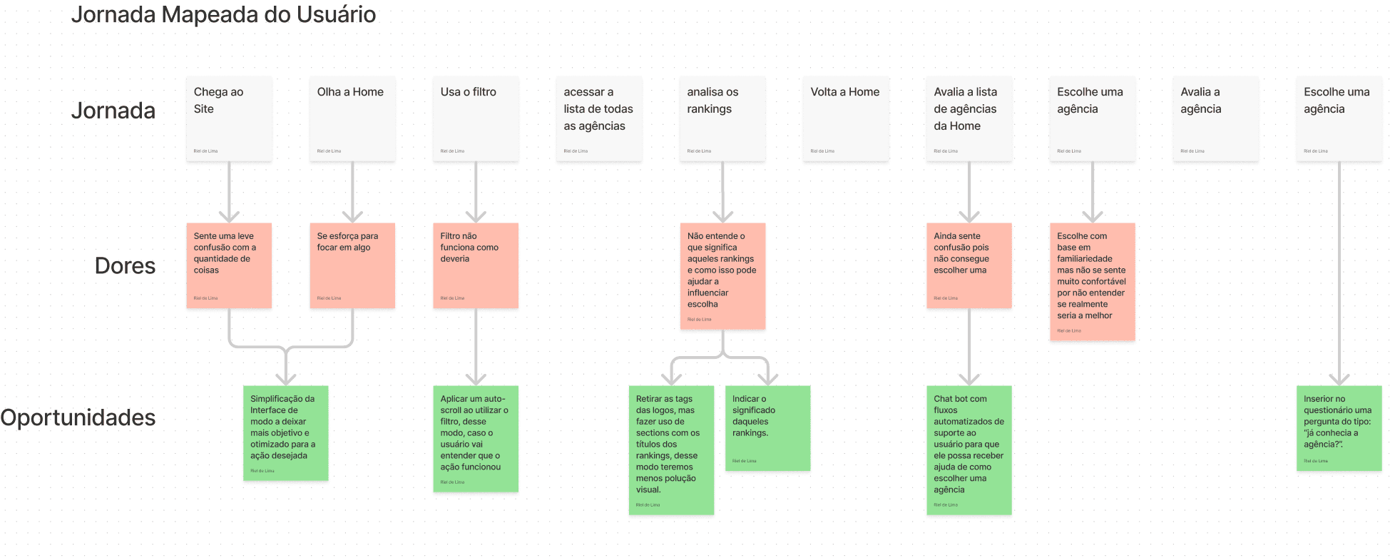
Improvements mapped
Enhance homepage UX with clearer micro-interactions and Google's navigation style.
Improve filtering with auto-scroll for better orientation.
Simplify tags by grouping them and adding ranking explanations.
Clarify certifications to highlight their value and agency expertise.
New Journey proposal
A user journey analysis was conducted to better understand behavior patterns when facing barriers. This was used as a basis for general improvements, aligned with the challenge’s main objective.
Expected Impact
Faster search process for finding an agency.
Optimized decision-making time when choosing an agency for a quote or contact.
Improved user journey through the sales funnel.

UI Improvement Suggestions
Ensure design consistency across all screens, pop-ups, and forms.
Improve contrast for better visibility.
Apply psychology principles to enhance UI effectiveness.
Refine "Partner" page for clarity and engagement.
Optimize whitespace in the "Services" section for readability.
Highlight agency case studies for greater visibility.
Clarify "Courses & Certifications" for better understanding.
Refine "Address" section for improved structure and usability.
Ideation / Design
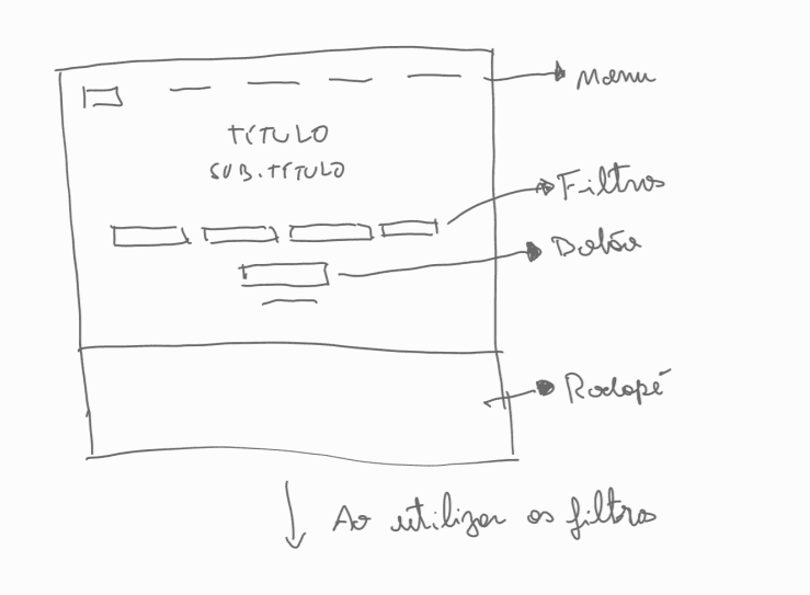
Hierarchy and Wireframing
On the basis of all the information gathered so far, I was able to start the improvement studies.
New Home
Simplified homepage interface with a focus on Menu, Highlights, Search Filter, and Interaction.
CTA button disabled until at least one filter is selected.
Button enabled once a filter is chosen.
On-screen message prompts users to select a filter if they click the disabled button.
Expected Benefits
Clear user guidance through key pages, highlights, and search.
Reduced distractions by removing the agency list upfront.
Faster decision-making with less cognitive overload and quicker searches
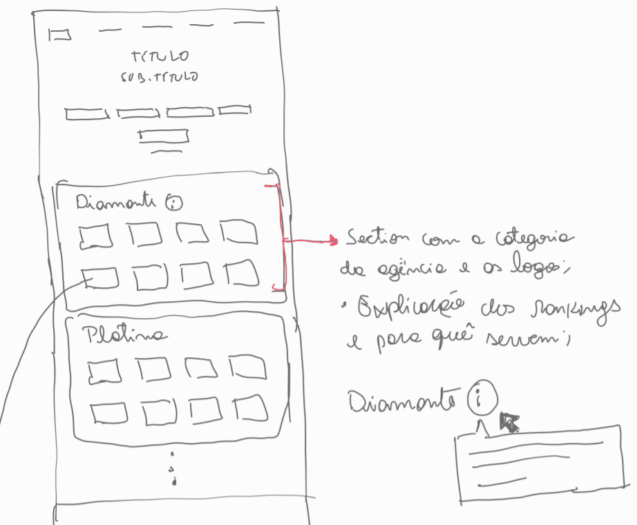
Post Filter Usage
Auto-scroll after filtering ensures clear result visibility, solving usability issues found in testing.
Reduces cognitive overload by improving clarity and removing interface noise.
Search results structured by ranking for better organization and easier navigation.
Cleaner layout than the current version, making information more digestible.
Clear ranking explanations to help users understand its impact on their choices.
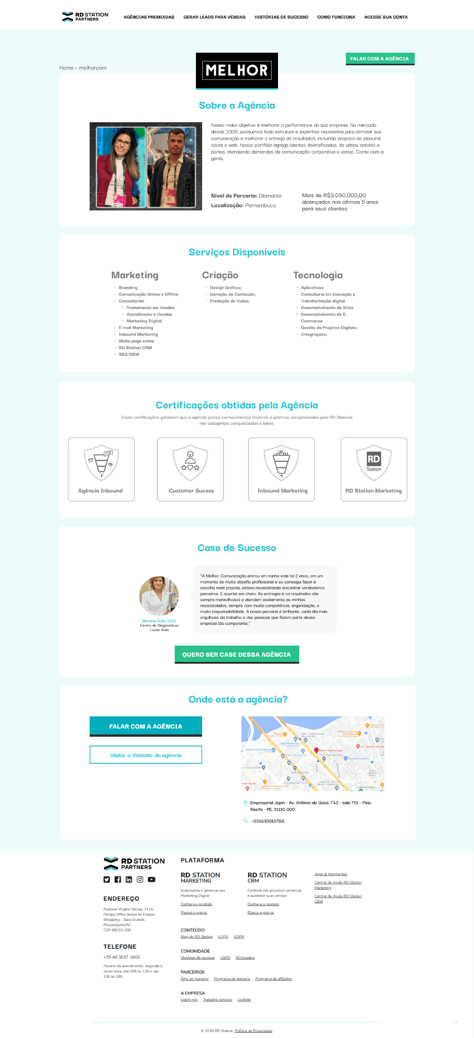
Agency Page
Centralized, vertical structure for better responsiveness and user experience.
Easier mobile adaptation, clear hierarchy, optimized white space, and intuitive step-by-step flow.
Additional improvements:
Clear certification explanations to highlight benefits.
Well-organized service list in categorized sections.
CTA placement at both top and bottom for higher engagement.

Prototype
High fidelity
Based on everything we've seen so far, I've come up with the following interface ready for testing:

User Testing Feedback
After developing this new version, I sent the prototype to our core user for feedback and her feedback was very clear:

From here, my next steps would be:
Checking where the product is most accessed ( Mobile or Desktop );
A/B tests between the new version and the version that is currently online;
Validate with quantitative data:
The page time
The functioning of the Journey and Funnel;
Whether users are achieving their goals;
Click-through rate on the CTAs on the Partners' pages;
Whether there has been an increase in contacts;
Number of conversions for RD Station compared to the previous standard;
Conclusion: Roadmap & Learnings
Roadmap
Validation with Tech Lead
Mobile responsiveness adjustments
Organizing files for Front-End development
Monitoring implementation progress
Defining key metrics with the PM & Marketing team
A/B testing for new page variations
User interviews to refine journeys and test variations
Stakeholder interviews (agency partners) to validate A/B test results
Continuous improvements & iteration cycle
Key Learnings
Best practices in Heuristics, Cognitive Biases, and Design Principles are essential for any website or product, as they have been studied and applied in various contexts.
This was confirmed through a General Design Analysis and user observation, where many pain points were directly linked to the lack of these best practices.
Consistency in design is crucial for a high-quality user journey and better attention to detail.
User observation is key to identifying challenges and making improvements that create a smoother experience, leading to higher conversion rates.


Thanks for your time!
(Obrigado por seu tempo)