

Obrigado por seu tempo!
(Thanks for your time!)

The Design Solution
The design solution focused on the main points of the brief, focusing to resolve all the problems related. We will see the solution point a point.


The MVP
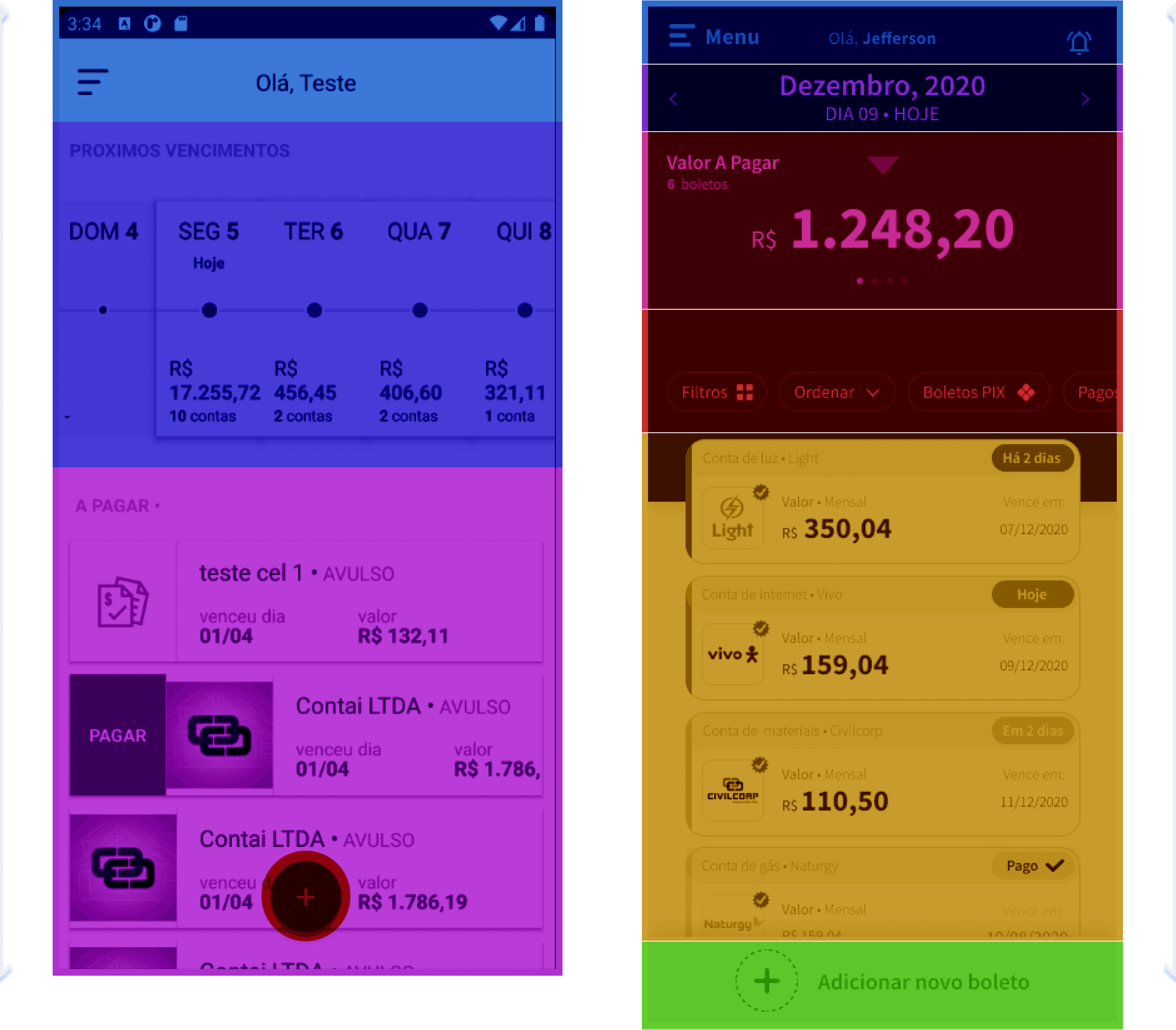
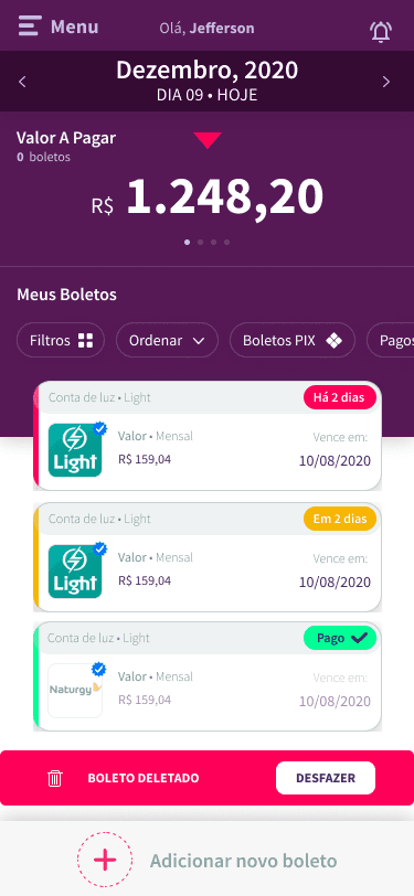
The first version of the product was designed focusing on only receive the bill. The first prototype proved itself and the startup conquest the first round and started to think about how to improve the product focusing on the two sides. The architecture and the design.


Home Flow
With more information, we need more caution with the overall structure of the flow, so the understanding/redrawing of some areas was necessary.
About the Home
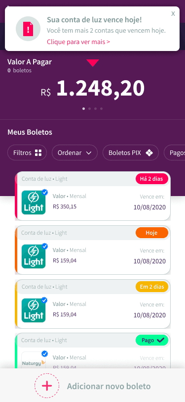
The home is the main structure of this product, with it the user has the whole vision of all the main functionalities to help deal with problems and have quick interactions that help him be more productive.

The main analysis of the old version
Users can see quickly the bills through a cards system;
The card system has shortcuts;
The calendar helps the user quickly see the next payment date;
The home has an input button for other bills that are not automated.
Has a Menu with other interactions.
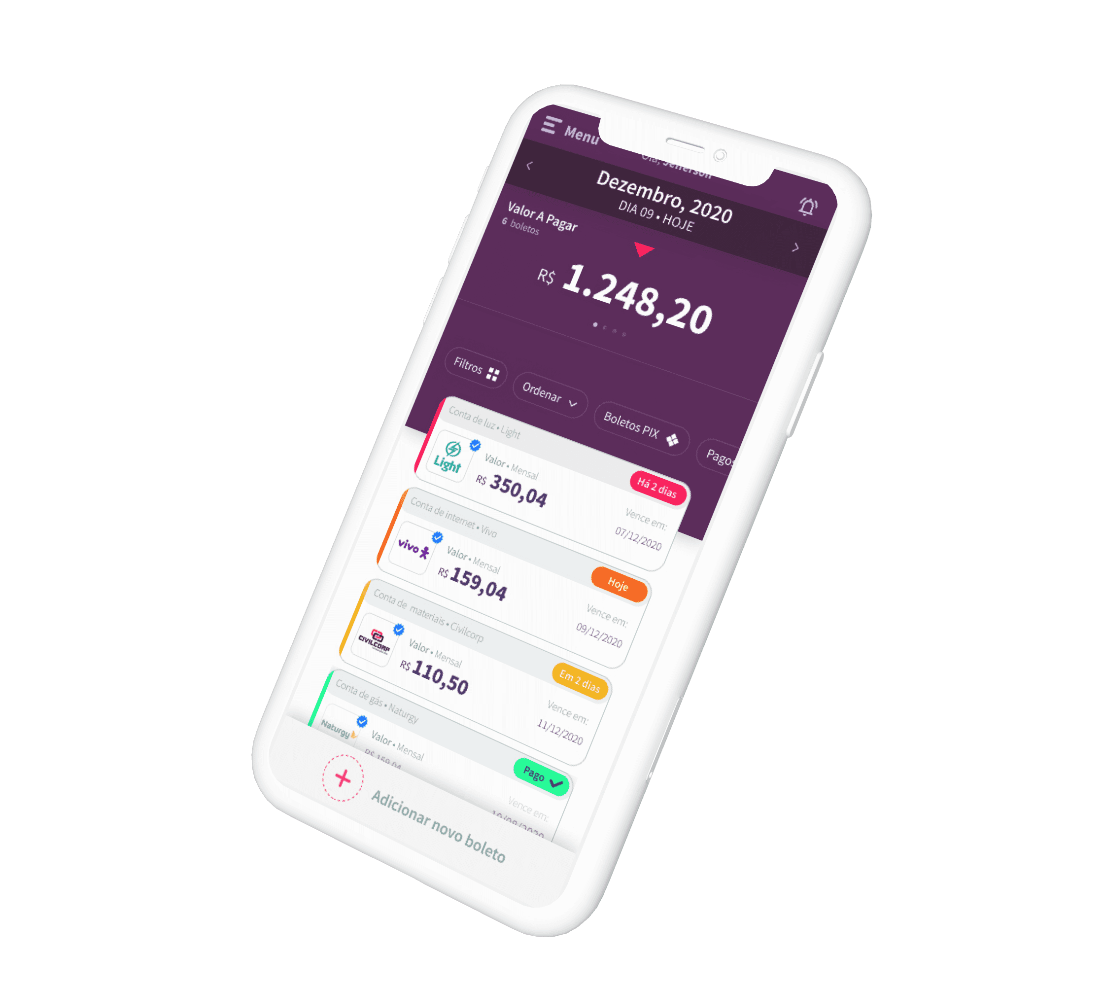
Improvements based on the founder’s vision, user feedback, research, and heuristics
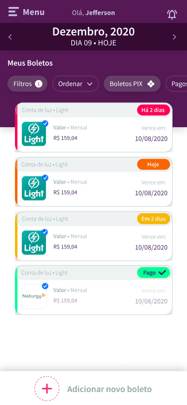
Simplified version of the calendar;
Focus on big numbers;
Filter + quick filter system;
Card System’s Redesign;
Quick interactions;
Rethinked Screen Flow;
Home Interactions
The home is the main structure of this product, with it the user has the whole vision of all the main functionalities to help deal with they problems and have quick interactions that help him be more productive.
Home + Menu, user name and Notifications icon.
The position of the Menu interaction was based on market research.
The menu area has its importance, but in validation meetings, the stakeholders wanted to maintain it on the top more discreetly.
The “menu” writing wasmaintained consideringg the new phase of this product, and based on a “safe play” to help the user clearly understand what is/where the menu is.
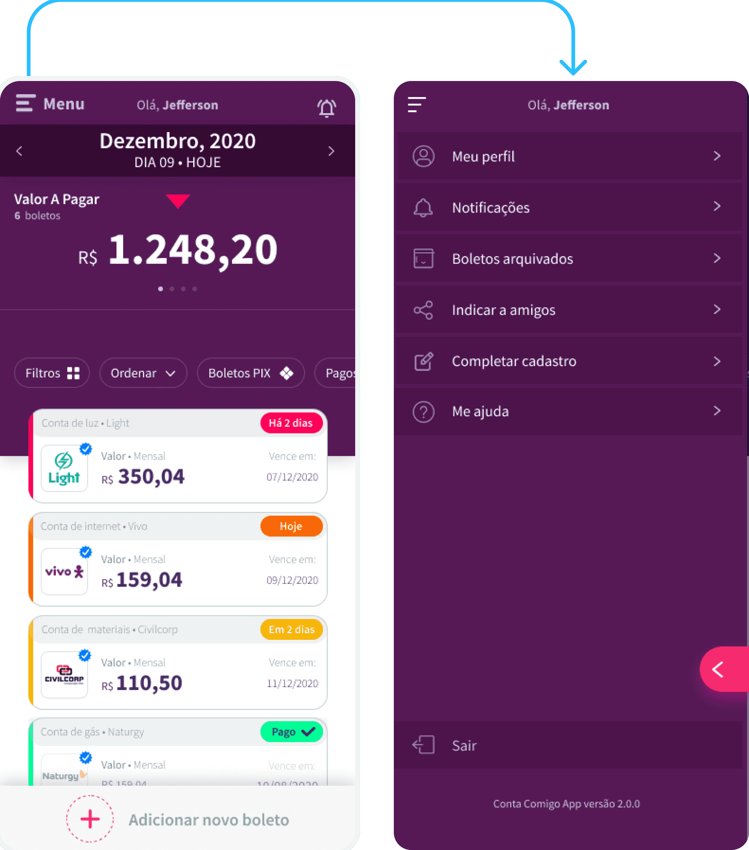
Calendar + Big numbers
The usability of both follows the concept of the carousel components. This impacts in the quick view of the near future management of the bills.
The two carousel work independently, but the calendar has the main relation with the calendar and influences the Big Numbers and the view os the card’s bills.

Notifications and Alerts
Here we have the market standard that helps the users quickly remember if a bill is coming closer to the payment day.
And other information about the connection with new companies selecting the Conta Comigo to send their charge to the user.

Filters
More market standards about the filter functionality with some additions based on the context of the app.
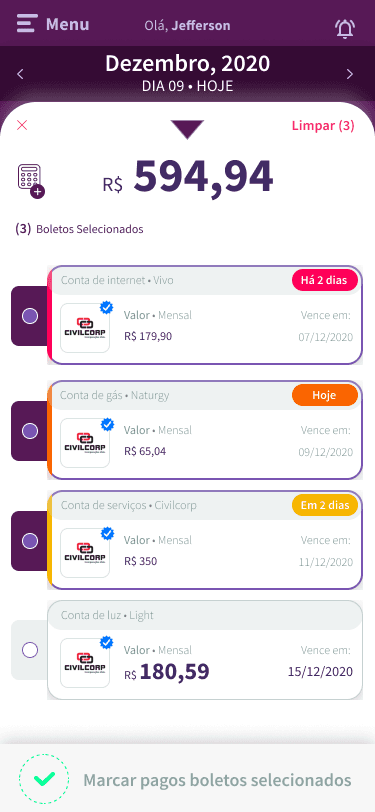
Calculator
This is a special functionality that helps the user to calculate specific bills they want by pressing and holding one bill and unlocking the selector.
They also can mark multiple bills as paid.
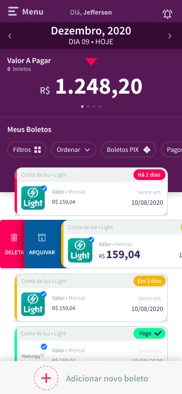
Delete and Archive
Another special functionality is the quick action for deleting or archiving a bill, by sliding the specific bill the user wants to right
The Toast with the option to cancel the action is related to a heuristic of error prevention.

Mark as Paid
The same slide functionality exists. For marking a bill as paid, the user just have to slide the card to the left.

Pop-up
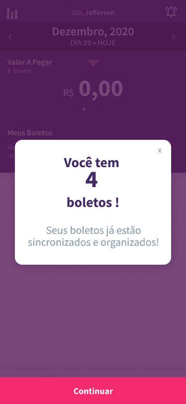
The pop-up it’s another important functionality that helps the business and marketing to offer promotions or ask the user to accomplish a specific action.


The Whys of the Thecnical Design
Why did I design the solution this way?

SourceSans Pro is excellent for apps due to its high legibility across screen sizes. Its neutral style and wide language support offer versatility. Being open-source makes it a practical choice for developers. Futhermore, this font it’s defined in the Conta Comigo brandbook for usage.
Typography

This kind os solution is based on two of the Nielsen Heurístics, the “visibility of system status” and the “consistency and standards”
Heuristics
This kind of solution is based on two of the Nielsen Heurístics, the “Error prevention” and the “consistency and standards”
Heuristics
8-pixel spacing is a standard in design and market, because it looks good, adapts well, easy to scale, and is easy to use.
Spacing: 8 Pixels
Purple is the primary color defined in the Conta Comigo Brandbook and it’s direct related to the trustworthiness and calmness.
Main Color
The other colors follow the market standards and the heuristic “Consistency and Standards”, like “Green for OK” and “Yellow for Attention”, helping the user to use the solution intuitively.
Other Colors

Conta Comigo App Redesign
Upgrading the overall user experience and usability


The Challange
Analyze: A startup founder has an MVP and needs a redesign the product based on his vision.
Redesign: Create high-fidelity, user-friendly interface.
Solve: Redesign the home, help to improve the overall usability and experience of usage and generate a foundation for the others flows.
My Goal: Propose and design solutions to improve efficiency and usability of the home flow.
Deliverables:
High-fidelity redesign of home page.
Integration of main funcionalities into redesigned interface