Neon Bank
CASE STUDY
LANDING PAGE REDESIGN
The Challenge
The case study emerged as a demand from the Aela course, basically redesigning the landing page to target new account openings, helping to improve conversion by up to 20% over the next 6 months.
Targets
Make it clear who Neon is;
Let you know what we have to offer;
Let you know why we can be trusted;
Convey trust, security, commitment and respect;
Keep the form standard and at the top of the page when the user opens the LP for the first time;
The process
Discovery
Understand the context of the banks, who Neon is, what landing pages are and what they are used for, who the competitors are and how they work their landing pages, how people see Neon's current landing page and what is important in a banking landing page for them to feel more confident about opening an account.
Ideation
Validations
Define what will be important to users from the point of view of building trust for opening an account and adapt it to the Neon bank landing page through a simple, easy and quick-to-understand information hierarchy.
Design/Test
Transforming the information into a navigable and structured interface, preferably already in hi-fi to collect feedback more quickly through user testing, in order to generate precise improvements to the project.
Delivery
Prototype and structured layout for the development team to implement and follow up on.
Why this process?
Because it is based on the foundations of Design Thinking and a User-Centered Design strategy, where by following these steps we will have a more precise, clear and targeted result for the people who will access the landing page in search of a banking solution for their lives.
What I wanted to achive?
Knowledge of the design of effective Landing Pages tailored to users' needs.
One focused on increasing conversion by solving users' needs.
More positive results in conversions as expected or on an even larger positive scale.
Helping people feel safe and informed about Neon, influencing them to open an account.
What is expected?
Users satisfied with the information available on the landing page;
Users feeling safe on the site, whether influenced by the visual design, usability or information available;
Ease of navigation through the landing page;
A tested solution with real feedback;
A navigable layout and prototype;
Positive results from user testing;
Few design adjustments;
Discovery
Desk Research
General Learnings: Neon and Banks
Main banking functions: Loans, foreign exchange, currency circulation, and transaction security.
Digital banks: Emerged in 2010, with digital acceleration increasing after the pandemic.
Fintechs: Disrupt traditional banking by prioritizing user experience.
Brazil: A global leader in banking digitalization.
Neon: A fintech offering a 100% digital account, not an actual bank.
Neon Pagamentos S.A.: Successor of the former Banco Neon, partnered with Banco Votorantim.
Card: Functions as a prepaid credit card.
Main benefit: Easy financial control.
Reputation: Rated 8.1 on “Reclame Aqui.”

Benchmark
To better understand the competitive landscape, I mapped out Neon's competitors to analyze their differentiators and feature patterns.
This approach allowed me to:
Study how competitors communicate and what actions they take.
Compare Neon’s current position in the market.
Identify opportunities for improvement based on user expectations and experiences.

Design Audit
The audit was conducted in a simplified manner to identify general issues. It was based on landing page research and a benchmark analysis of two key competitors: Banco Next and NuBank. These competitors were chosen based on four factors: Size, Maturity, Relevance to digital bank users, Availability and clarity of information on their landing pages

Assumptions raised
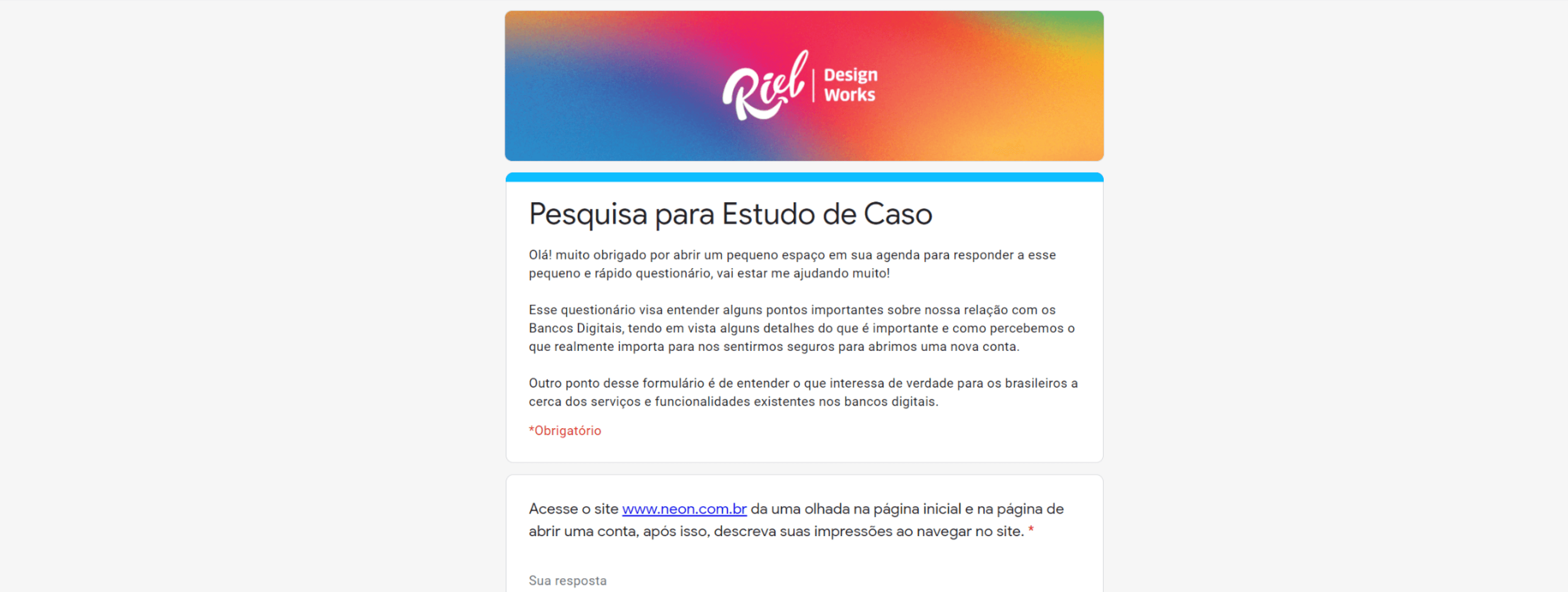
Based on the research and analysis, some assumptions were raised that could be validated by a perception survey with the public:
- Neon's landing page may be converting below 20% due to a lack of information and an excessively simple design, which may convey a lack of reliability compared to competitors.
- There is a lack of relevant information, such as rates, card fees, benefits and differentials.
- In order to achieve 20% conversion in 6 months, LP needs to offer more information in line with the standards of Next and Nubank.
- Neon's focus this year is to attract the C class, so the LP must include details about investments, facilities for using the card, cashback and aspects that reinforce security, control and enrichment.
What needed to be evaluated

Before developing the questionnaires, I mapped out key points to clarify the focus of this quantitative research based on previous assumptions and findings:
Perception & Trust: Assess user trust and whether the current landing page provides enough information.
User Expectations: Identify what information users expect to see on a digital bank's website before signing up.
Investment Interest: Determine if users are interested in investments and financial education.
The visual solutions and the whys
Participants were asked to visit Neon's website and evaluate key aspects, including:
Website appearance perception
Sufficiency of relevant information for opening an account
Important items they expect to see before signing up for a digital bank
Their level of financial education

Results, Insights & Learnings
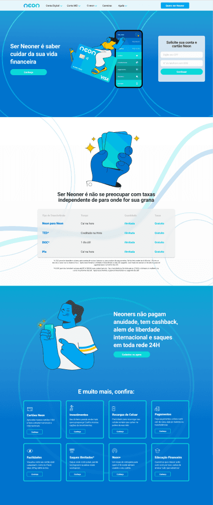
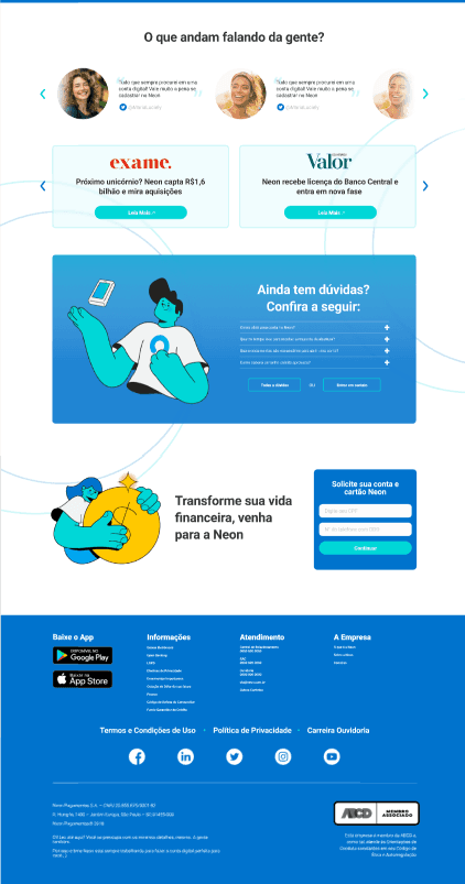
Users like the simplicity but feel it lacks credibility and find it strange to input sensitive data before switching to the app.
Some described the design as childish or unprofessional.
While some found navigation easy and pleasant, others disliked the site structure enough to avoid opening an account.
47.1% said the current site lacks sufficient information.
23.5% found the information sufficient.
29.4% were undecided, mentioning other factors like testimonials, recommendations, and specific details influencing their decision.
20 key pieces of information were identified as important before opening an account.
20 essential services were mapped as important for a digital bank to offer.
88.2% believe financial education and investments are important topics.
64.7% have made some form of investment.
Most respondents consider financial education and investments to be valuable differentiators for banks and fintechs.
Definition
Motivations
After the survey confirmed the initial assumptions, the next step was to analyze user feedback and prioritize the most important information for the new Landing Page.
To achieve this, I used MoSCoW, a simple feature prioritization method, which I'll explain next.
MoSCoW
The main reason for using this tool at this stage is its ability to simplify feature prioritization with a straightforward logic.
Using this method, I mapped out what to focus on, what is important but secondary, what could be included, and what can be left out for now.
This prioritization was structured in a table, categorizing each feature based on when it should be implemented.
For this project, I based the decisions on:
User votes from the survey for both information and services.
Benchmark analysis to reinforce prioritization

Metrics definition
To ensure accurate prioritization, evaluation metrics were defined for future user testing. These metrics will validate functionality, confirm alignment with previous research, and provide greater confidence to the marketing team in their decisions for the new Landing Page.
The key metrics are: User Feedback, Ease of Use, Information Relevance, Trustworthiness, Performance, Completed Tasks
Information Architecture + Userflow
Based on the prioritization, I structured an information hierarchy linked to a specific Landing Page flow.
This structure was shaped by:
MoSCoW prioritization and Analysis of Banco Next & NuBank landing pages.
By using two of the largest fintechs in Brazil as a reference, the hierarchy follows a familiar structure for Brazilian users, reinforcing:
A sense of security
Pattern recognition
Best practices in visual and structural design

Design & Prototype
Wireframe
For this wireframe, I focused on strong contrasts between key elements and general information already planned for the layout.
This approach was chosen to simulate a tight deadline, requiring a structure closer to a final version. To achieve this, I prioritized:
Contrast and content emphasis, General usability evaluation, UX Writing assessment
This structure met all the prerequisites needed to move on to the next phase

High fidelity
For this wireframe, I focused on strong contrasts between key elements and general information already planned for the layout.
This approach was chosen to simulate a tight deadline, requiring a structure closer to a final version. To achieve this, I prioritized:
Contrast and content emphasis
General usability evaluation
UX Writing assessment
This structure met all the prerequisites needed to move on to the next phase
User Testing - Questions
For the user test, I followed a similar approach to the initial phase, conducting a usability and layout test. Participants were asked to evaluate:
What the site conveyed from their perspective
If they opened an account with Neon
If any important information was missing
To attempt starting the account opening process
After the test, they answered open-ended questions related to these four points.
The main reason for this approach was to validate the new Landing Page based on users' own words, ensuring it met expectations for information, trust, and usability.
Additionally, insights from this test serve as positive indicators that our goals can be achieved in the coming months.

User Testing - Results
The results were very positive, with users providing valuable feedback on interface and interaction improvements.
80% showed clear interest in opening an account, indicating a potential increase in new sign-ups.
70% felt no important information was missing, proving that listening to users, understanding their needs, and prioritizing features using MoSCoW, benchmarking, and research led to solid results.
90% found the account opening process “easy and simple”, suggesting a likely increase in new users.
The open-ended feedback encouraged users to suggest improvements and missing features, which helps strengthen trust, security, and the company's commitment to its users.

Conclusion: Learnings & Improvements
Key Learnings
Users are the best source for understanding what makes them feel secure and confident when opening a digital bank account.
Following competitors' standards is useful, but it doesn’t always reflect what users truly need—sometimes, missing information can be a decisive factor in choosing a bank.
Metrics are crucial, even in user testing phases, as they help guide efforts more efficiently and support data-driven decisions.
Benchmarking is valuable, but some competitors may not prioritize user research—a large competitor doesn’t always follow good UX practices, heuristics, or user-centered design principles.
Bonus Learnings
Understanding banking history helps in grasping the core principles that have shaped traditional banks over time.
Recognizing the key differences between fintechs and digital banks.
Landing pages play a major role in building user trust and influencing decision-making.
Areas for Improvement
Technical Improvements
Always review contrast after applying colors.
Even under tight deadlines, having a well-structured style guide for each project improves the hi-fi design process.
Process Improvements
Improve efficiency in identifying and mapping evaluation metrics in user testing.
Find ways to further streamline the overall process, even though this project was already considered fast-paced in the market context.


Thanks for your time!
(Obrigado por seu tempo)