The design solution focused on the main points of the brief, focusing to resolve all the problems related. We will see the solution point a point.


Key deliverables included:
High-fidelity redesign of messaging page.
Proposed solutions with rationale (text, sketches, etc.).
Integration of solutions into redesigned interface (if applicable)
My goal:
Propose and design solutions to improve efficiency.
Dealing with the Problem
During the discovery process, I identified challenges in managing high request volumes and proposed two key solutions:
1. Automatic Trigger Buttons: Streamlined follow-ups with dedicated buttons for scheduling exams and sending reminders to patients, reducing manual workload.
2. Enhanced Client Cards: Added intuitive icons to indicate report readiness, enabling quick status checks and improving task prioritization.
These improvements optimized workflows and enhanced the overall user experience.
1# Solution
During the discovery process, I identified challenges in managing high request volumes and proposed two key solutions:
1. Automatic Trigger Buttons: Streamlined follow-ups with dedicated buttons for scheduling exams and sending reminders to patients, reducing manual workload.
2. Enhanced Client Cards: Added intuitive icons to indicate report readiness, enabling quick status checks and improving task prioritization.
These improvements optimized workflows and enhanced the overall user experience.
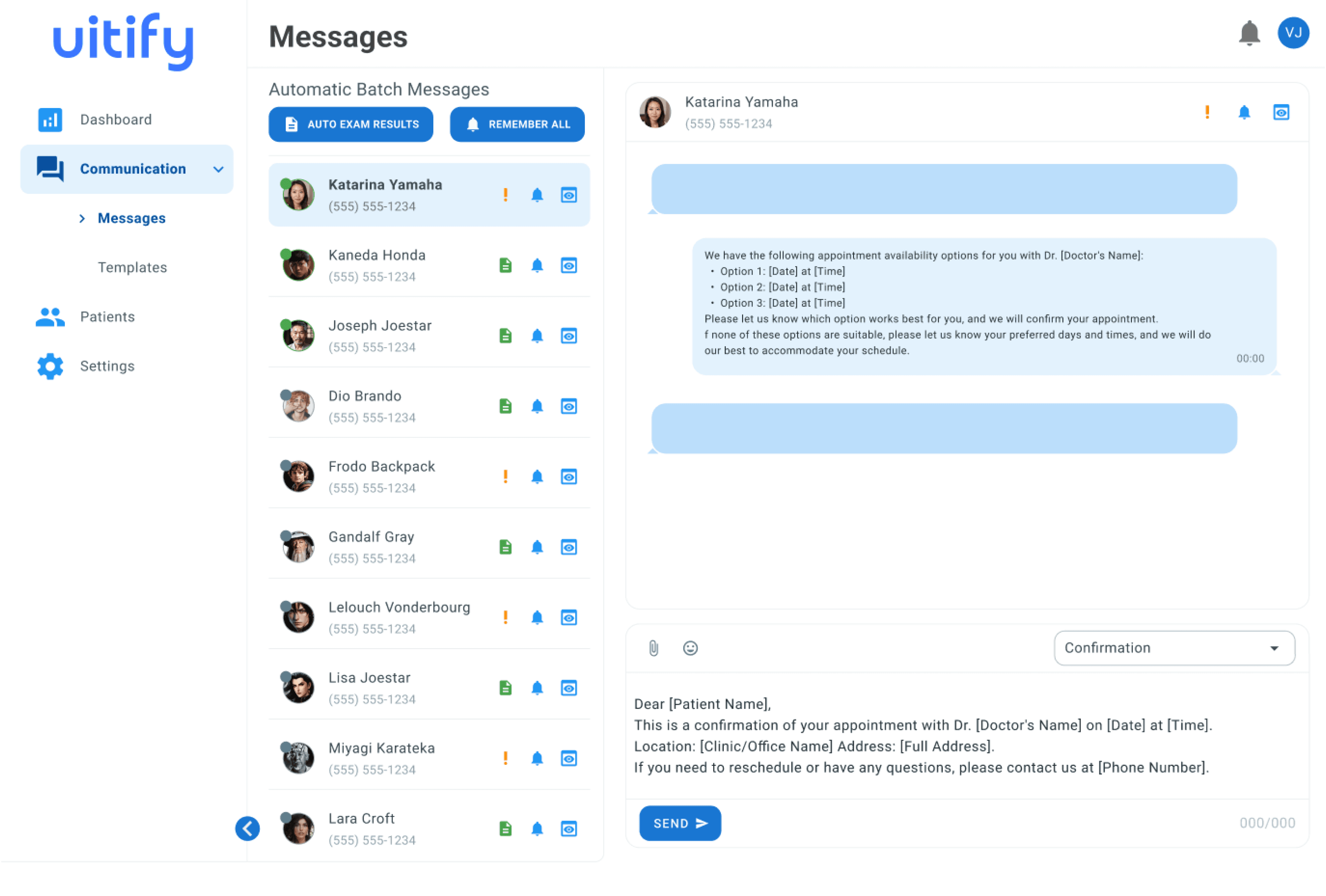
2# Solution
The second solution focuses on enhancing patient chat cards for better clarity and efficiency.
Key features include:
Yellow Exclamation Icon: Indicates an issue with the exam result, requiring attention.
Green Paper Icon: Signals that the exam results are ready for delivery.
Bell Icon: Provides a shortcut to send a reminder to the specific patient.
Screen with Eye Icon: Opens a quick summary modal for an overview of the patient’s details.
This design allows receptionists to quickly assess statuses and take appropriate actions with minimal effort.
3# Solution
The interface, originally resembling an email preview, was redesigned into a chat-focused layout, making it easier for receptionists to manage client interactions through messaging apps.
With AI-powered chatbot automation, receptionists only step in for specific cases requiring human support.
The three-icon strategy in the patient bar adds flexibility, enabling quick access to key functions like resolving small issues, validating contexts, and sending reminders that are more likely to be noticed.
This solution ensures efficiency while balancing automation with a human touch, offering a seamless and personalized experience.


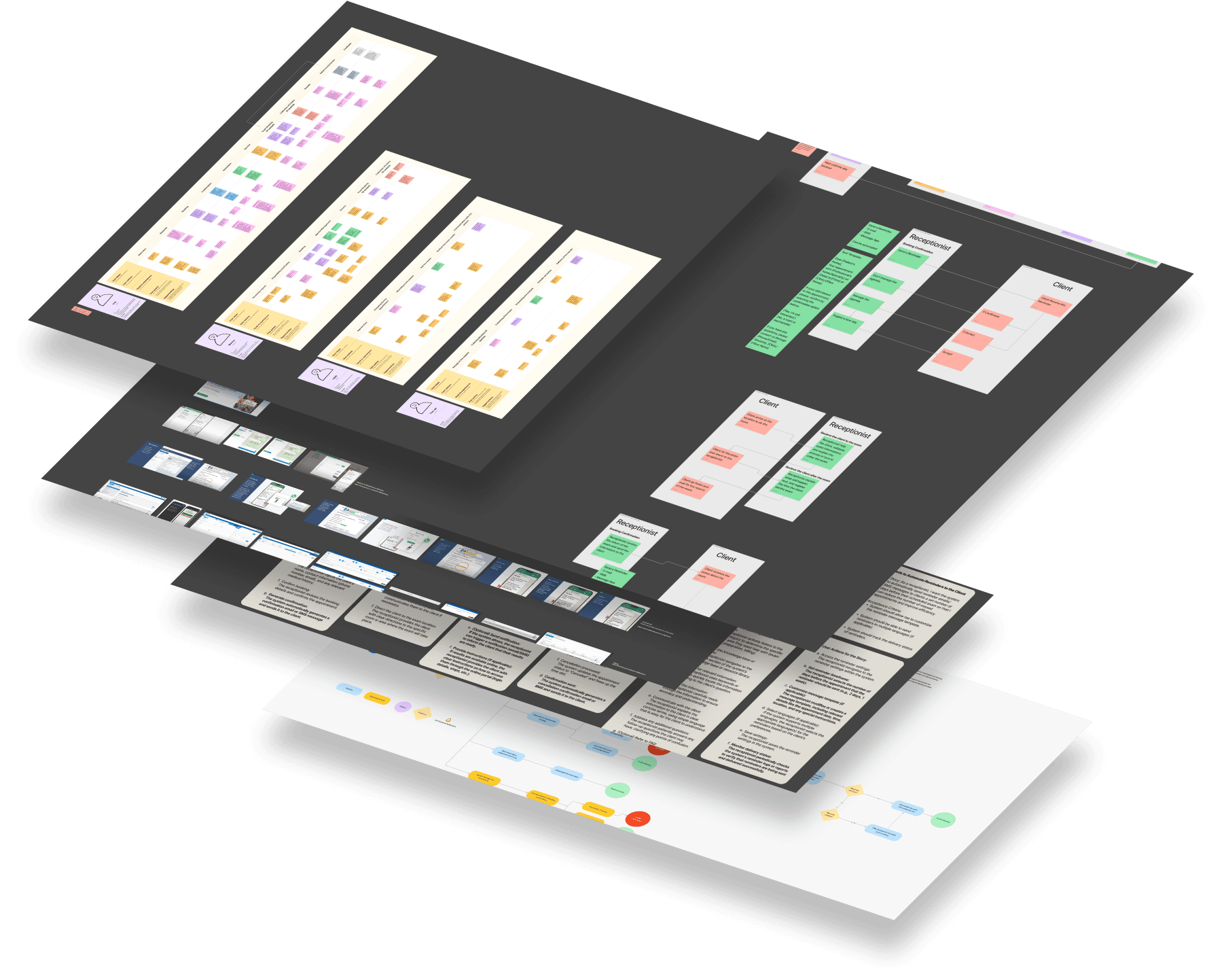
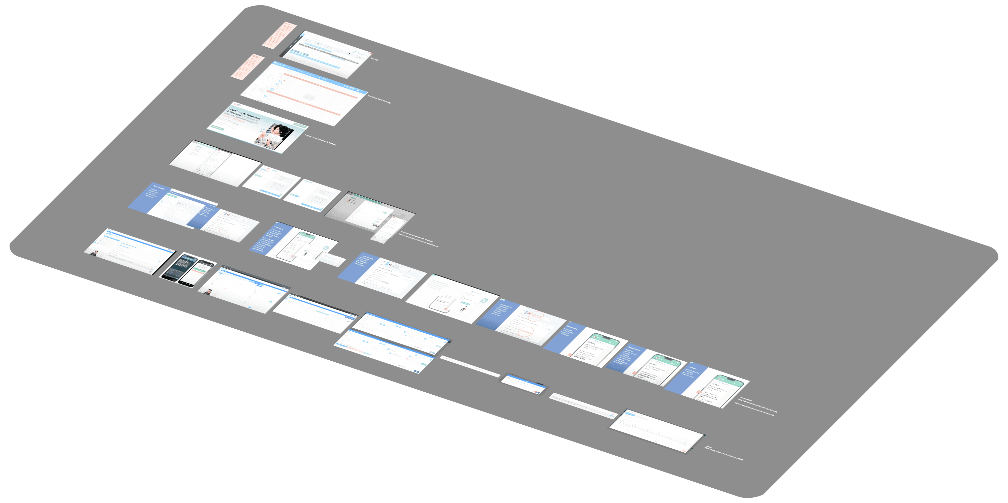
Research
Journey Mapping
Stories
Design
Validations
How I Discovered this Solution?
This didn't happen magically.


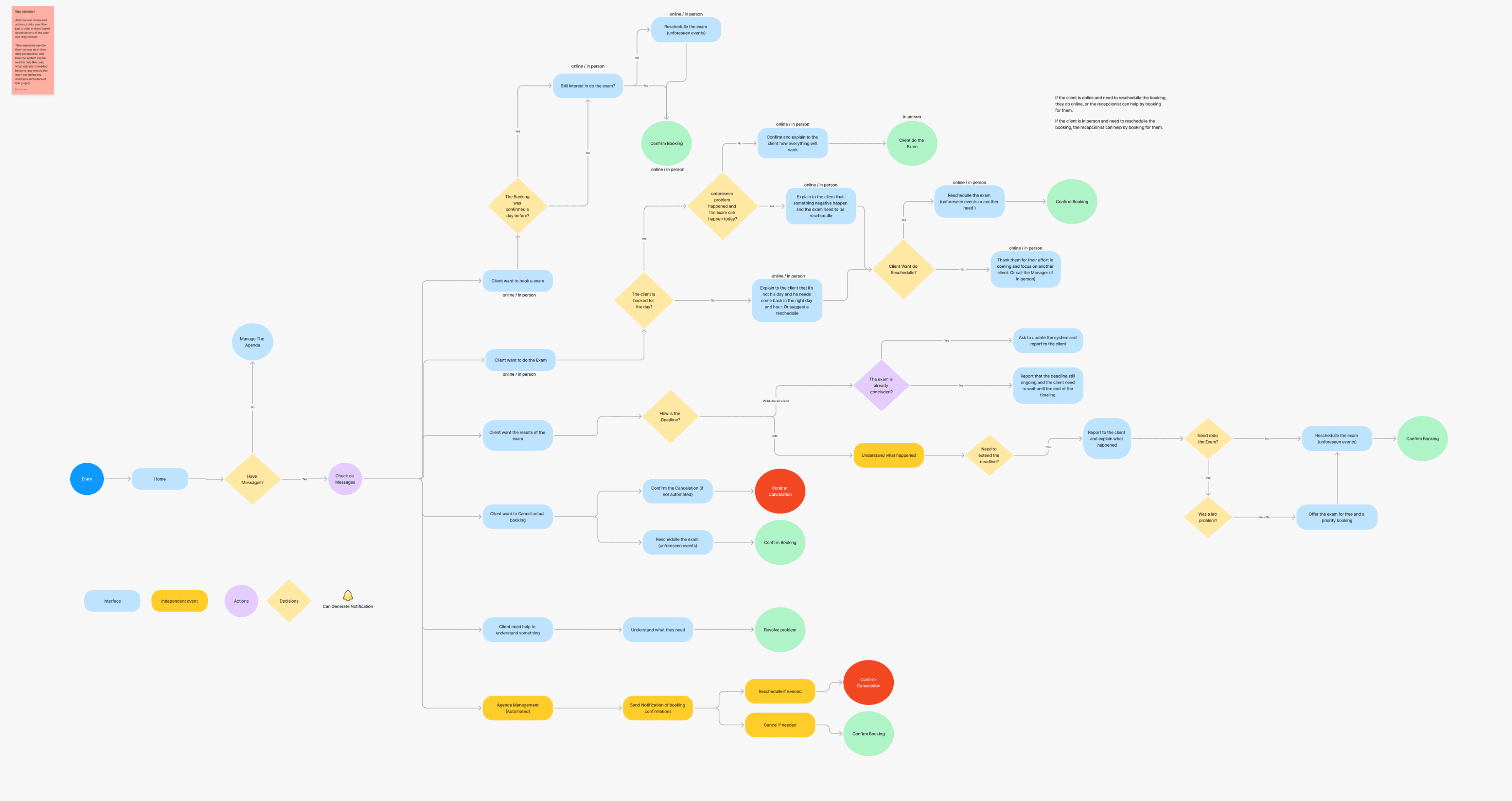
5# - User flow
After a deep understanding about the macro and micro context, mapping user stories and actions, I created a user flow to visualize the user's actions within the system and applying some of the first ideas to resolve the main problem.
This helped me understand their daily workflow, how the system can assist them, the necessary validations, and how to design the wireframes/interface with the solution applied.
Things I learned in this step:
A clear understanding of how the solution can be applied
Notice the Overall Flow and the unique flow that will be the foundation of this test.
And a possible backlog to improve the project even more.