


I'm here to help make the home of the app even better!
My goal is to suggest and create solutions that will make the home more efficient and user-friendly. We'll work together to design a new, improved homepage and integrate key functionalities into the new interface.
Discovery +
Benchmark
Design
Validations
Delivery
Desk Research
Why I Choose this method?
Due to a lack of documented information on the product’s evolution, I could only rely on Desk Research, Benchmarking, and Founder's and Investor's information.
These were the only methods available to build a solid foundation for the redesign proposal and understand the overall context.
Brazilian Internet Growth
2021
84% of Brazil Population
152 million users
2022
87,2% of Brazil Population
161.6 million users
Mobile adoption
2020
234 million users
2021
253.31 million users
Bills Management
Bills emissions it’s very
commom in Brazil, for
companies and people
in general.
People have challenges to manage multiples bills, deadlines to try to avoid forgetting or not pay the bills.
The importance of integrated tools
With the growing of digitalization the demand for solutions that integrated bills and centralize the financial management increased
Apps that helps the user
to centralize they bills and
manage with notifications,
calendar alerts, etc, starts
to be part of life of a effective
financial management
Potential Market
2021
84% of Brazil Population
152 million users
It’s estimated that 50% of this population it’s active economically and deals with bills, the potential market it’s around 76 million users.
2021
Around 5.75 million active companies in Brazil. A growth of 5.8% from 2020.
The number of companies is very significant to be ignored, with the possibility to sell API to integrate the bills management in their systems.
Monetization
for traditional users
Monthly
Monthly subscription at R$10, with the adhesion of 1% of the market (around 760.000 users) the monthly revenue it’s about R$7.6 millions or R$91.2 million annual.
Comission
With a tax of R$1 paid for the bill, each user paying five bills monthly will result in R$3.8 million monthly or R$45.6 million annually.
Monetization
for companies (API)
Monthly
Monthly subscription at R$100, with the adhesion of 20% of the market (around 1.15 million users) the monthly revenue it’s about R$115 millions or R$1.38 billions annual.
Comission
With a tax of R$0.50 paid for the bill, processing 100 bills monthly will result in R$57.5.8 million monthly or R$690 million annually.
Problems detected
for traditional users
Bill Emission
Undue Charges and
Unsolicited Bills
Lack of Support
Incompatibility with
special characters
Needs and Insigts
for traditional users
Payment
Centralization
Notifications
and Alets
Easy to Use
Tech support
improvements
Problems detected
for companies
Technical
Problems
Double charge
Undue Charges
Unsolicited Bills
Lack of Support
Needs and Insigts
for companies
Improve API
Integrations
Security
Flexibility and
Personalization
Receivables
Management
Detailed
Reports
The Benchmark
Bills Emission
All as Fast Emission
(less than 30 secs)
7/10
Have personalization
Collection management
8/10
Automatic
Reminder
6/10
Have automatic
value update
Integration and automation
8/10
Has APIs
9/10
Have automation
of recurring billing
Payment Methods
7/10
Offer credit and debit card,
payment links and traditional bills
Reports and Monitoring
9/10
Offers dashboards with
bill status with data
analisys
Security
All plataforms
send registred bills
(FEBRABAN)
Support
6/10
Offers dedicated support
The hypotheses and assumptions were informed by the founders' and investors' vision, the designed MVP, user feedback regarding competitors, as well as the needs and pains of the companies.
Based on the research, a bills centralization application aimed at individuals should include functionalities that simplify financial management, promote organization, and prevent default. Below are the recommended functionalities, organized by category:
Centralization and Organization
Bills Registration: Scanning, PDF Upload, and Automatic Imports by e-mail
Payment Management: Bills visualization by category and payment history
Automation and Reminders
Personalized Notifications: Alerts to pay bills, late and pending payments
Automatic Renewal: For recurrency bills like rent or monthly
Integrations and Payments
Payment diversity: Directly through PIX, Debit or Credit Card.
Banking Integration: Banking accounts integrations to automated payment or bill detection.
Financial Planning: Monthly resume of bill payed, to pay and pending.
Goals definition: Limit setup for expenses by category or not.
Security and Privacy
Secured Login: Authentication by biometry, facial recognition and/or private code.
Cryptography: Data protected by cryptography end to end
Backup: Cloud synchronization to avoid loses.
Tags and Notes: Allow users to insert tags and annotations in the bills.
Interface Customization: Theme chooser (clear/dark) and category organization.
Help Center: FAQs, Chats with human support.
Integration with “Reclame Aqui”: Quick acess to solve problems.
Challenges and Rewards: Points per bills paid, rewards with discounts in payment taxes.
Automatic benefit search: Discount identifications and renegotiations to late bills.
Paid Voucher Storage: Automatic organization of paid bills with option to download.
For the context of this case, the focus here is the Home and the main functionalities we can have
UI Analysis
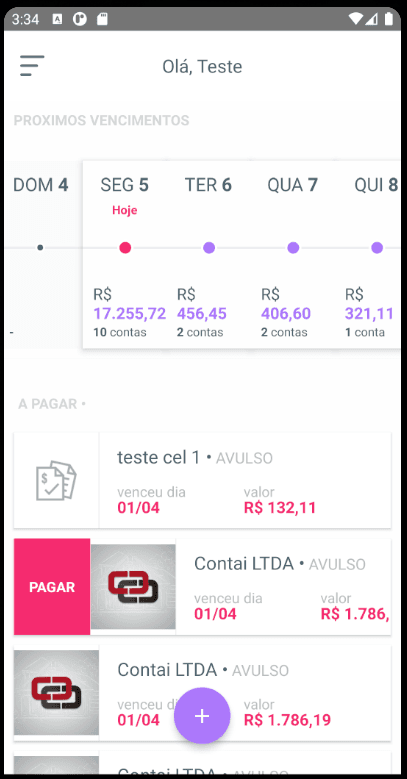
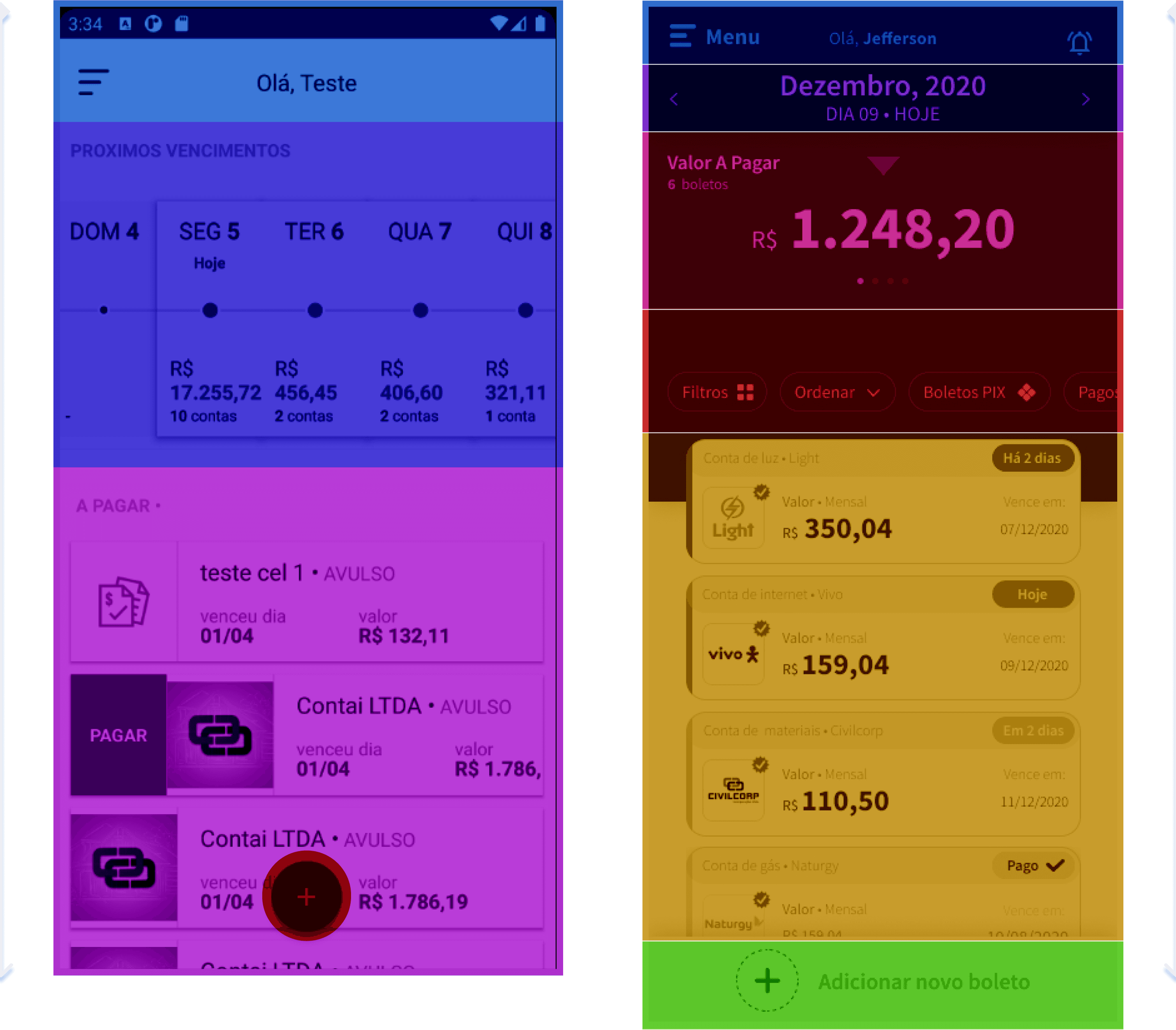
The first version of the product was designed with the sole purpose of receiving the bill. This prototype was a great success, and the startup was delighted to secure the first round of investments. They then set about thinking about how to improve the product, focusing on two key areas: the architecture and the overall design.

The Home


Synthesis
The main analysis of the old version
Users can see quickly the bills through a cards system;
The card system has shortcuts;
The calendar helps the user quickly see the next payment date;
The home has an input button for other bills that are not automated.
Has a Menu with other interactions.
Improvements based on heuristics and benchmark
Simplified version of the calendar;
Focus on big numbers;
Filter + quick filter system;
Card System’s Redesign;
Quick interactions;
Rethink Screen Flow focusing in importance’s zones;

Once I'd done all the research and analysis, I started to map out the old journey, which would be the basis for the new one. I focused on the points for improvement that had been raised previously in the research and analysis.
We really focused on the main points of the brief and tried to resolve all the problems related to it. We'll take a look at the solution point by point, so you can see exactly what we did.


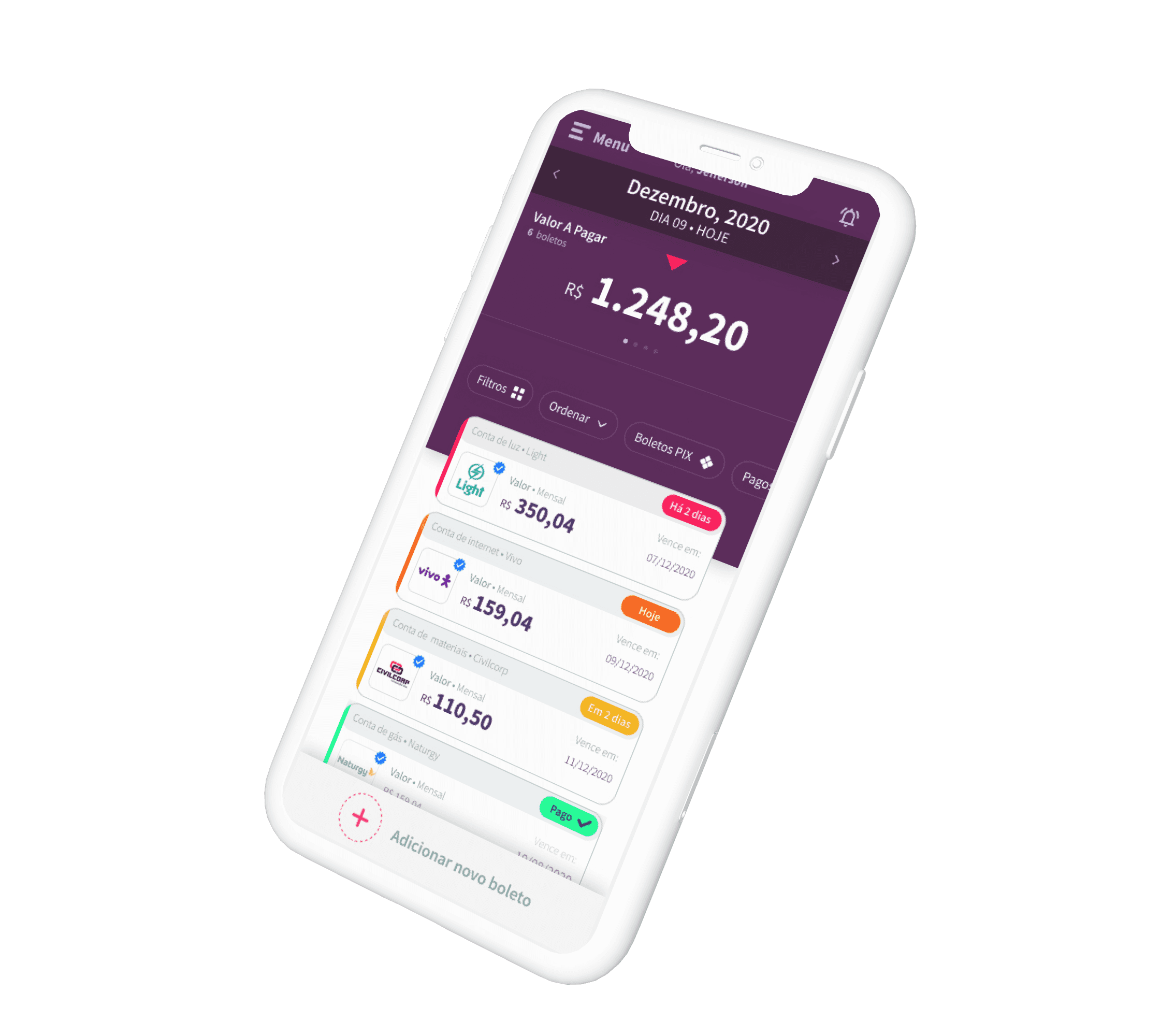
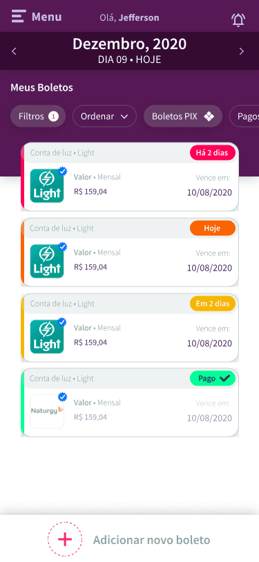
The home is the heart of this product. It's all about making your life easier! With it, you can see all the main functionalities at once, so you can quickly deal with any problems and get on with your day.
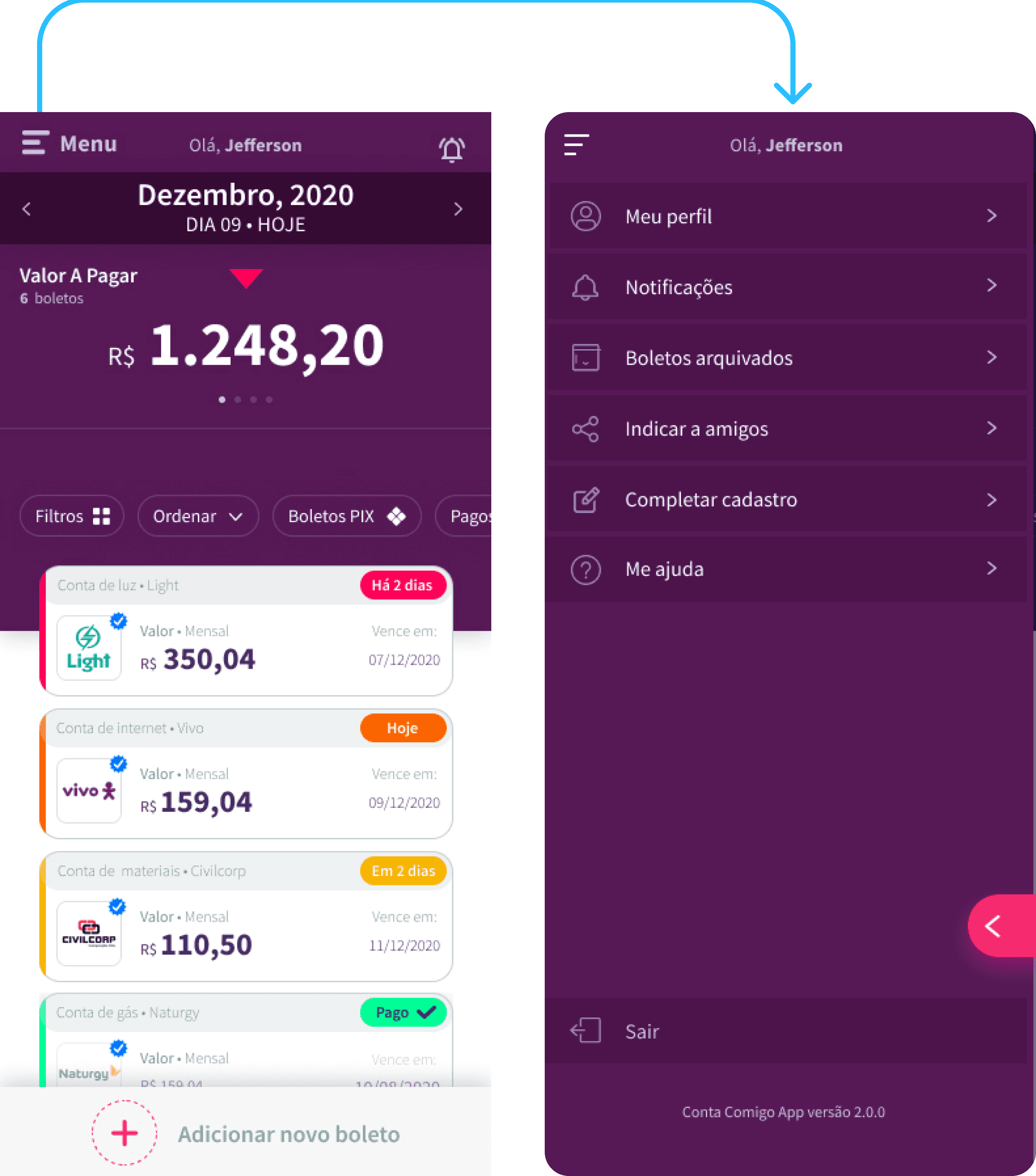
Home + Menu, user name and Notifications icon.
We made sure to place the menu where our customers would find it most convenient based on some market research I did.
The menu area has its importance, but in validation meetings, the stakeholders wanted to maintain it on the top more discreetly.
The “menu” writing was maintained considering the new phase of this product, and based on a “safe play” to help the user clearly understand what is/where the menu is.
Calendar + Big numbers
I've designed both to be easy to use, following the concept of the carousel components. This makes it super simple to keep on top of your bills soon!
The two carousels work independently, but the calendar is the main link. It influences the big numbers and the view of the card's bills, so it's a vital part of the system!


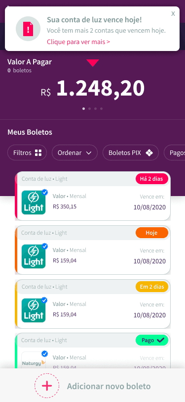

Filters
More market standards about the filter functionality with some additions based on the context of the app.
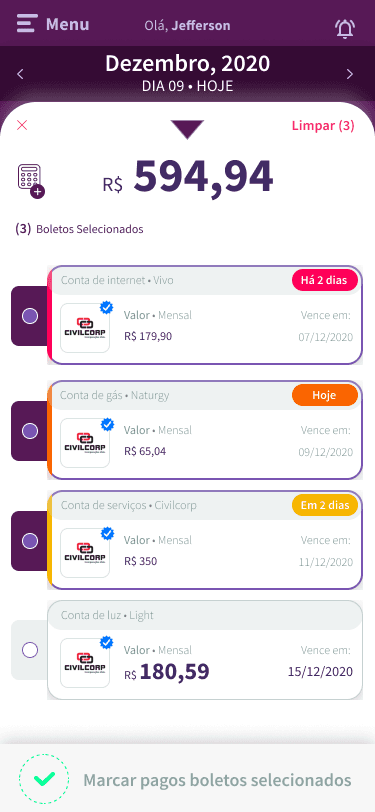
Calculator
This is a special functionality that helps the user to calculate specific bills they want by pressing and holding one bill and unlocking the selector.
They also can mark multiple bills as paid.
Delete and Archive
Another special functionality is the quick action for deleting or archiving a bill by sliding the specific bill the user wants to right. The Toast with the option to cancel the action is related to a heuristic of error prevention.
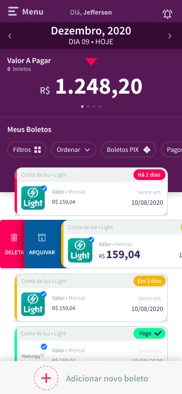

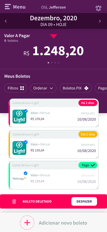
Mark as Paid
The same slide functionality exists. For marking a bill as paid, the user just have to slide the card to the left.

Pop-up
The pop-up it’s another important functionality that helps the business and marketing to offer promotions or ask the user to accomplish a specific action.

With more information, we need more caution with the overall structure of the flow, so the understanding of some areas was necessary.
By including more possibilities in the app’s home screen, the flow needed to be carefully rethought.
The calendar was shortened to give more room for the carousel of information with big numbers (important for the users) and give more space for the cards.
The filter system received a good space directly above the cards.
The menu and notifications were shrunk a little but without prejudice in overall perception.
The input bill button now has a fixed area at the bottom of the screen.
The screen rhythm now follows a more fluid sequence thinking in a way that every part has its importance, but, trying not to invade the different zones.
While the designs are being created, I sometimes needed to chat with the front-end team and the architect to get their input. They're great at suggesting alternatives to help us work around any technical limitations we might face with the technology we're using in this project.
Once we've got their seal of approval, the designs go for final validation with the startup owners and investors. If all goes well, we hand them over to the development team and get started on the design documentation.
About Metrics and Funnels
To ensure the success of the app, it's crucial to define metrics and funnels that monitor and optimize the user experience while evaluating the solution's financial performance. Here are the key recommended metrics and funnels that we define while the product is designed:
Metrics Management Suggestions
Acquisition and Activation
Number of downloads: This will help the marketing team understand the effectiveness of the marketing campain
Activation Tax: This will help understand what is the % of the users that download the app and completed the sign up flow and started the app
Engagement
DAU and MAU: Helps to understand how many users use the app daily or monthly, this reflects on the engagement.
Retention Rate: % of users thath keeps using the app after a defined period of time (ex. 7 days, 30 days, 90 days, etc).
Usage Frequency: How many times a user acess the app for a spectif period.
Session time: How long the user stay in the app for each session.
Conversion
Conversion tax for payments: % of bills that are payed through the app.
Avarege time for the first payment: How long a user takes from the sign-up flow to the first payment.
Monetization
Average Revenue per user (ARPU): Revenue generated per user for a period of time.
Acquisition Cost per User (ACU/CAC): How many cost to acquire a user that really uses the app for pay they bills?
Lifetime Value (LTV): Total value estimated generate by a user in they whole lifetime in the app.The total value estimated by the app for a user's whole lifetime
Support and Satisfaction
Churn Rate: Percentual of users that left the app after a certain period.
Net Promoter Score (NPS): The probability of users recomend the app for other people.
Time for Support Resolution: Average time to solve user's problems.
Funnels
Onboarding
Steps: Download > Sign Up > Onboarding > First bill registration
Objective: Understand where the user is dropping off and optimize the activation testing solutions to improve the retention in this moment.
Payment
Steps: Bill resgistration > Bill visualization > Payment journey > Payment finish
Objective: Monitor the conversion in each step of bill payment journey to understand where are the barriers that can help the conclusion.
Retention
Steps: First use > weekly recurring use > monthly recurring use >
Objective: Evaluate the usage of the product and includestrategies to improve rentention.
All elements in the app were componentized. Because in my context I've worked solo on this project for 5 months, and the project focus was related to reducing the time to market at the extreme, I just did the basic structure directly in Figma with proper documentation to help the devs code the components more quickly


(Obrigado por seu tempo)